-
Architects: RIGI Design
- Area: 240 m²
- Year: 2017
-
Photographs:Fangfang Tian

Text description provided by the architects. Kai Liu designed this white 3-story residence in a common Shanghai old-style lane.
There are plenty of similar buildings in Shanghai which is not new, and located in a naturally-formed block, carrying the memories of this city.

The original architecture was completed in 1947, which consists of 3 floors, 5.5 meters in width, and about 15.2 meters in depth. It faces south and has entrances in both sides. Due to the complicated compartments and deep depth, the overall indoor lighting was bad. As it was built long time ago, part of the building structure need to be repaired, we also reinforced the whole architecture, and unified the height of the entire building. The staircase in the northern side was torn down, Skylight and staircase are designed to be the center of the architecture, reshaping the whole logic and form of this 3-story building. Punched holes,the steel stairs can bring in light, The stairs go upward around the natural light patio from the 1st floor, extending the whole house vertically around the light.


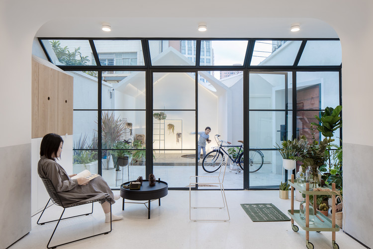
Kai Liu designed a semi-opened area on the 1st floor which blurs the boundary between indoor and outdoor. After reconstruction, the original isolated courtyard has a new connection with the 3-story space. The semi-outdoor space adds enough warmth into living room. Sunshine, plant, interior, exterior, and blurry boundary allows spaces and life scene to switch freely. A hole is reserved in the courtyard, where to plant tree in Spring, which could accompany the kids to grow up - time is also a part of our design.

On the 1st floor, the sunlight living-dining room and the kitchen are designed as a whole space, where family spend most of time together. We hope this space belongs to every scene of life, instead of being defined by functions. We designed a whole modular furniture wall, called "life board", which can be decorated or assembled by accessories in diverse ways, along with life changing. From this point of view, we hope the future form of the design could be gradually shaped by daily life.


On the 2nd floor, the door and the storage space are hidden behind the wall, which creates a clean and complete area. During sunny days, it will be a warm family space.

The kid's bed, desk and storage space are connected through our design. The kid likes the house very much, climbing stairs, playing in the courtyard, which is also our design original purpose - to bring a bigger world to the kid, allowing him to know about the changing world from another dimension.

Following natural daylight, going up along the steel staircase, we can see modified skylights, vertical lighting windows and a pure outdoor space. This is the area we modified most. The whole building starts from light and vertical space. For the main bedroom, we kept the slope structure of original building, unified the cloakroom and the toilet into a box, reserving the original architectural form to the largest extent and creating a new connection in the original space which is not big.

We want to design something carrying beauty and happiness. There is not so much joy in life, and our life is filled with small happiness. What we love is not to possess good things or luxurious furniture, but a self-made life on our own. Having seen so many houses, the only concept we believe is that a person cannot be stuck with a settled life, whether in the house value or style.

A house is not equal to home, home belongs to us and our family. A house is like a container to carry our growth, experience and hope. And design, brings more tolerance into life.

The city where we live and work is not perfect, and there are even some disorder traffic and a lot of garbage, but it is not an obstacle for us to design a warm house. This is a house of 1970s, witnessing the lives of generations. At this moment it seems to be reborn.
This is the meaning of our life, to be better.


